Example: Visual analytics of building energy efficiency
Authors: Himanshu Dongre, Aakash Kolli
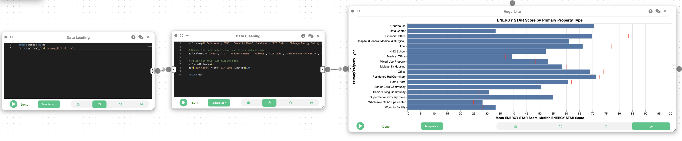
In this example, we will learn how Curio can be used to perform a comparative analysis of building energy performance. The process involves loading and cleaning a dataset of Chicago buildings, then making a visualization to benchmark the energy efficiency across different property types.
Here is the overview of the entire dataflow pipeline:
Before you begin, please familiarize yourself with Curio’s main concepts and functionalities by reading our usage guide.
The data for this tutorial can be found here.
For completeness, we also include the template code in each dataflow step.
Step 1: Load energy efficieency data
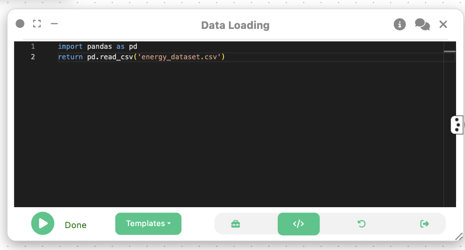
We begin by loading the energy efficiency dataset into Curio using a Data Loading node.
Step 2: Data cleaning and processing
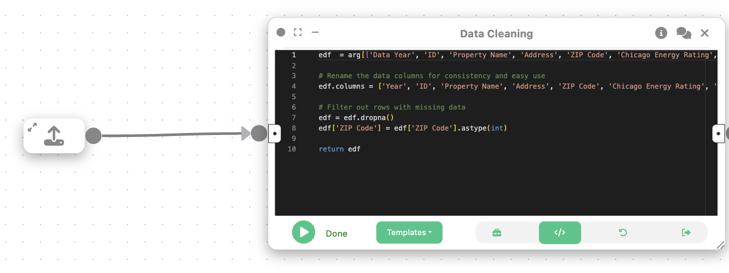
Next, we create a Data Cleaning node to preprocess the data to retain only the key attributes and remove incomplete rows. We also convert the ZIP code to an integer for consistency.
iedf  = arg[['Data Year', 'ID', 'Property Name', 'Address', 'ZIP Code', 'Chicago Energy Rating', 'Community Area', 'Primary Property Type', 'Gross Floor Area - Buildings (sq ft)', 'Year Built', '# of Buildings', 'ENERGY STAR Score', 'Site EUI (kBtu/sq ft)', 'Source EUI (kBtu/sq ft)', 'Weather Normalized Site EUI (kBtu/sq ft)', 'Weather Normalized Source EUI (kBtu/sq ft)', 'Total GHG Emissions (Metric Tons CO2e)', 'GHG Intensity (kg CO2e/sq ft)', 'Latitude', 'Longitude', 'Location']]

# Rename the data columns for consistency and easy use
edf.columns = ['Year', 'ID', 'Property Name', 'Address', 'ZIP Code', 'Chicago Energy Rating', 'Community Area', 'Primary Property Type', 'Gross Floor Area', 'Year Built', '# of Buildings', 'ENERGY STAR Score', 'Site EUI', 'Source EUI', 'Weather Normalized Site EUI', 'Weather Normalized Source EUI', 'Total GHG Emissions', 'GHG Intensity', 'Latitude', 'Longitude', 'Location']

# Filter out rows with missing data
edf = edf.dropna()
edf['ZIP Code'] = edf['ZIP Code'].astype(int)

return edf
Step 3: Visualization – Mean and Median Chart
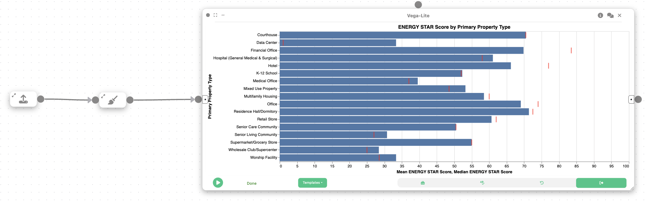
Then, we create a 2D Plot (Vega-Lite) node to create a bar and tick chart, which compares energy efficiency metrics across property types. This chart displays the mean and median of a selected metric (e.g., weather normalized site EUI) for each property type.
{
  "$schema": "https://vega.github.io/schema/vega-lite/v5.json",
  "data": { "name": "table" },
  "title": "Mean and Median Weather Normalized Site EUI by Property Type",
  "width": 700,
  "height": 400,
  "layer": [
    {
      "mark": "bar",
      "encoding": {
        "x": {
          "field": "PRIMARY PROPERTY TYPE",
          "type": "nominal",
          "sort": "-y",
          "title": "Property Type"
        },
        "y": {
          "aggregate": "mean",
          "field": "WEATHER NORMALIZED SITE EUI (KBTU/SQ FT)",
          "type": "quantitative",
          "title": "Mean Weather Normalized Site EUI"
        },
        "color": {
          "field": "PRIMARY PROPERTY TYPE",
          "type": "nominal",
          "legend": null
        }
      }
    },
    {
      "mark": { "type": "tick", "color": "black", "size": 40 },
      "encoding": {
        "x": {
          "field": "PRIMARY PROPERTY TYPE",
          "type": "nominal"
        },
        "y": {
          "aggregate": "median",
          "field": "WEATHER NORMALIZED SITE EUI (KBTU/SQ FT)",
          "type": "quantitative"
        }
      }
    }
  ]
}
Final result
The final result of this workflow is a layered chart that presents both the mean and median energy use intensity for various building types. Displaying both metrics reveals important details about the data's distribution as a large gap between the mean and median values for a category shows that a few highly inefficient buildings are skewing the average. Recognizing this distinction helps in developing more effective energy efficiency policies and programs.