👟 Quick Start Tutorial
This tutorial will guide you through creating a Vega-Lite barchart visualization using the dataflow interface. We'll connect nodes to visualize a simple dataset, demonstrating Curio's core functionality.
Before You Begin
Make sure you have Curio installed and running. If you haven't installed Curio yet, check out our Installation Guide.
🌱 Getting Started
Step 1: Launch Curio
After installation, start Curio and open your browser to access the interface. You'll see a blank canvas ready for building your first dataflow.
Step 2: Understanding the Blank Canvas
When you first open Curio, you'll see a blank canvas like this:
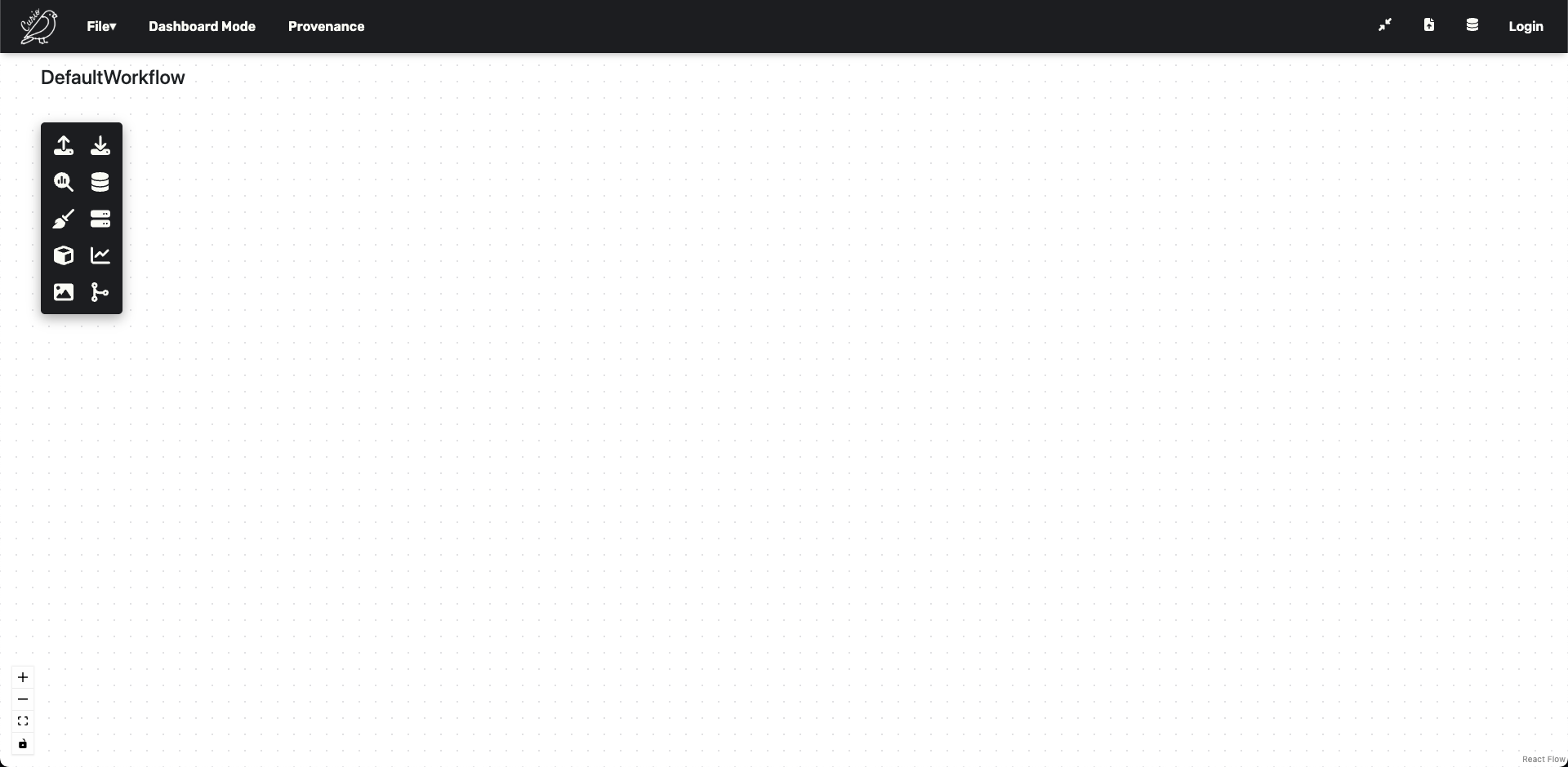
The icons on the left-hand side can be used to instantiate different nodes, including visualization ones.
📊 Creating a Barchart
In this tutorial, we are going to learn how Curio can easily help with visualizing a simple dataset using a Vega-Lite barchart.
Step 3: Add Data Loading Node
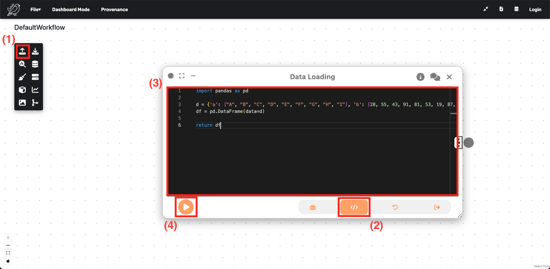
Let's start by instantiating a Data Loading node:
- Drag the Data Loading icon from the left sidebar.
- Change the view to
Code. - Enter the following synthetic dataset:
import pandas as pd

d = {'a': ["A", "B", "C", "D", "E", "F", "G", "H", "I"],
     'b': [28, 55, 43, 91, 81, 53, 19, 87, 52]}
df = pd.DataFrame(data=d)

return df
return will output df for the next node.
External Files
External files can be referenced through regular Python file handling functions, given that the file was uploaded to the server. For simplicity, we're using synthetic data here.
Step 4: Add Vega-Lite Visualization Node
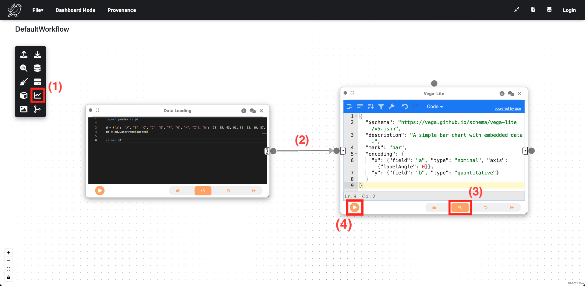
Now we'll create the visualization:
- Drag a
Vega-Litenode. - Connect it to the Data Loading node.
- Switch to the
Grammarview and enter the Vega-Lite specification.
{
  "$schema": "https://vega.github.io/schema/vega-lite/v5.json",
  "description": "A simple bar chart with embedded data.",
  "mark": "bar",
  "encoding": {
    "x": {"field": "a", "type": "nominal", "axis": {"labelAngle": 0}},
    "y": {"field": "b", "type": "quantitative"}
  }
}
Data Flow Magic
Curio handles the data-flow automatically - Vega-Lite has access to the DataFrame outputted by the previous node.
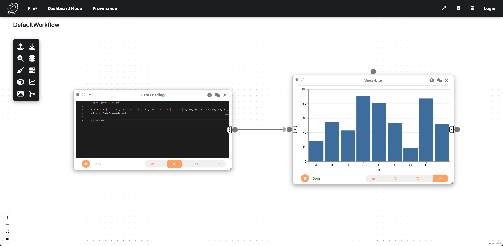
Step 5: See Your Results
After hitting run, you can see that a barchart was created:
Congratulations!
You created your first data-flow using Curio! 🎉
🔍 What You've Learned
In this tutorial, you've learned:
- Node Creation - How to instantiate different types of nodes.
- Code vs Grammar Views - Different ways to configure nodes.
- Data Flow - How data passes between connected nodes.
- Vega-Lite Integration - Creating visualizations with grammar of graphics.
🎉 Next Steps
Congratulations! You've created your first Curio workflow. Here's what to explore next:
Continue Learning
- Explore Examples: Check out pre-built workflows in the examples gallery.
- Try Advanced Features: Experiment with UTK integration and interactive dashboards.
- Build Complex Workflows: Connect multiple nodes for urban analysis pipelines.
Common Use Cases
Curio excels at:
- Visual Analytics - Integrating heterogeneous urban datasets with interactive visualizations.
- Scenario Planning - What-if analysis and real-time urban development simulations.
- Machine Learning Workflows - Human-in-the-loop model training and evaluation.
- Energy & Environment - Building efficiency analysis and green infrastructure mapping.
- Interactive Dashboards - Multi-view coordinated exploration with UTK and Vega-Lite.
🆘 Need Help?
If you encounter any issues:
- Check Node Outputs - Look for error messages in node execution results.
- Validate Connections - Ensure data types match between connected nodes.
- Community Support - Ask questions on Discord
- Report Issues - Open an issue on GitHub
Ready to dive deeper? Explore our curated Examples for advanced capabilities of Curio! 🚀